Data Dashboards & Visualizations
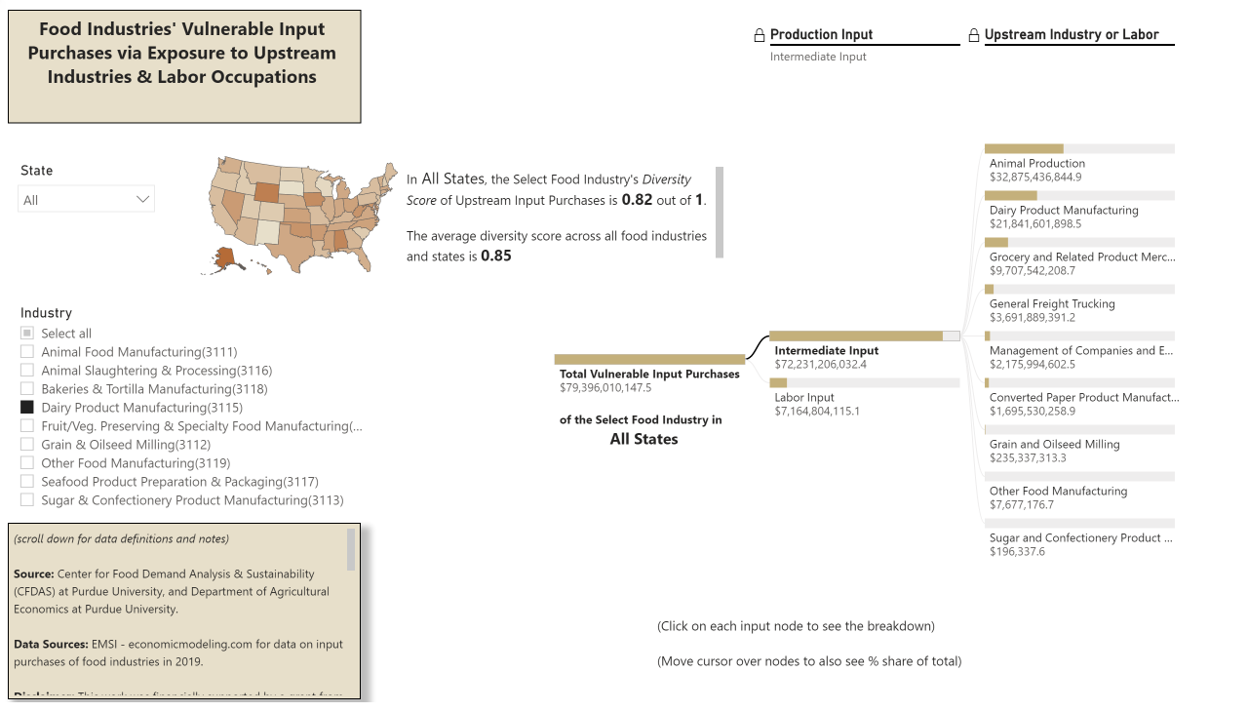
This dashboard shows the vulnerability of input purchases for each food industry in each U.S. state. First, using a Diversity Score on a scale from 0 to 1, the dashboard shows how diverse are the upstream input purchases of a select food industry. A higher diversity score means that intermediate input purchases are evenly spread across upstream industries. A lower diversity score means that intermediate input purchases are concentrated in a few upstream industries. The average diversity score is 0.85 across all states and food industries. Second, the dashboard shows the total dollar amount of vulnerable input purchases for a select food industry, and further breaks that down into (i) intermediate inputs and (ii) labor inputs. And within each input category, the user can also see the respective upstream industries and labor occupations that are a source of input purchase vulnerability.
The dashboard should help executive decision-makers and policymakers to understand and think about vulnerabilities of food industries from an input purchase perspective. A shock to any of the upstream industries or labor groups in the dashboard can result in cascading effects, hence potentially affecting food production and food security within a region or the country.
The dashboard is based on a recent study by Ahmad Zia Wahdat and Jayson L. Lusk from the CFDAS and the Department of Agricultural Economics at Purdue University: The Achilles Heel of the U.S. Food Industries: Exposure to Labor and Upstream Industries in the Supply Chain. (November 5, 2021). Available at:[SSRN Paper]
[Dashboard Webpage] [Purdue Newsroom]
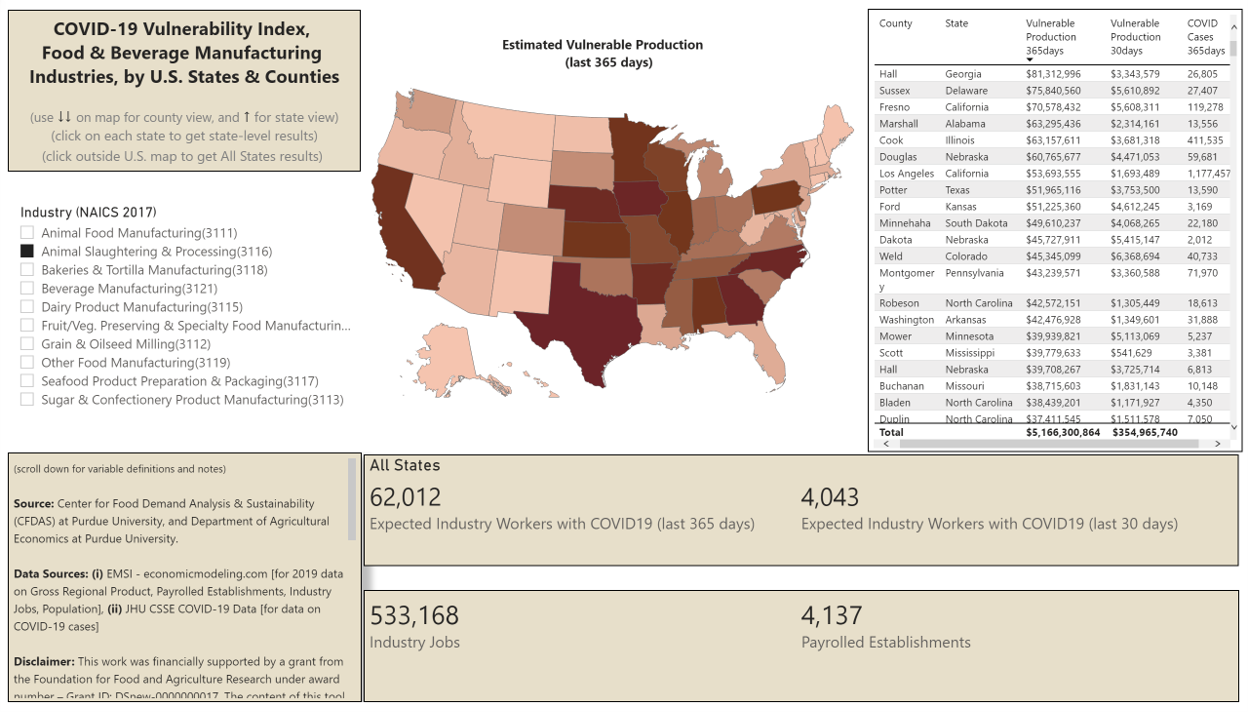
Dashboard Purpose: This dashboard presents the estimated value of vulnerable production in food and beverage industries due to estimated COVID-19 cases among industry workers. Users can find information on estimated vulnerable production in the past 365 days and past 30 days; COVID-19 industry worker cases in the past 365 days and past 30 days; total industry jobs, and total payrolled industry establishments. This dashboard can display information both at the state and county level.
[Dashboard Webpage] [Purdue Newsroom]
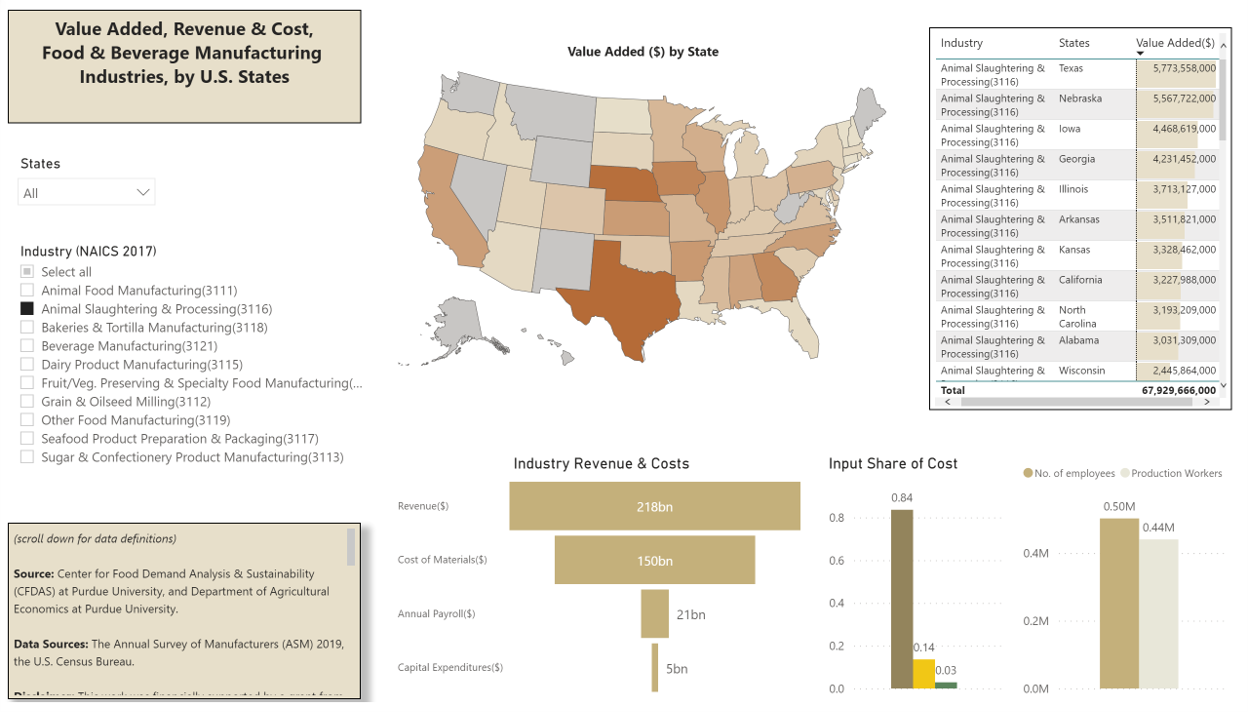
Dashboard Purpose: The U.S. food and beverage industries are the connecting link between the agriculture sector and the grocery retail sector. In a nutshell, the U.S. food and beverage industries buy raw inputs from farmers and sell final or intermediate products to both consumers and producers. This dashboard provides information on each industry’s production value, revenue, costs and employment. All such information is presented at the U.S. state level.
[Data Visualization] [Medium Article] [World Bank VizRisk Challenge Participant]
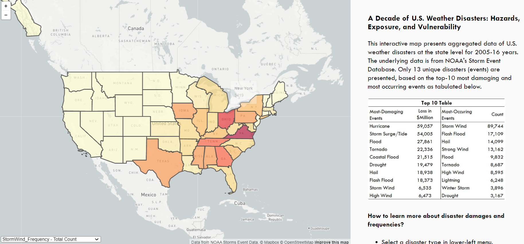
Visualization Purpose: This interactive map presents aggregated data of U.S. weather disasters at the state level for 2005-16 years. The underlying data is from NOAA's Storm Event Database. Only 13 unique disasters (events) are presented, based on the top-10 most damaging and most occurring events as tabulated below.